I suspect this is a fairly new feature, but I haven’t spent a lot of time recently looking at sold prices.
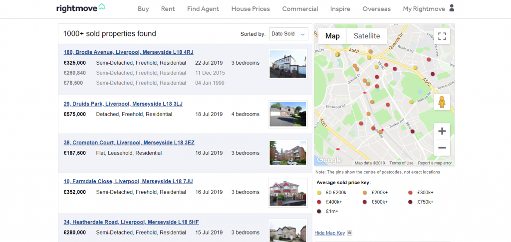
The colour code relates to price.
It’s a nice feature, which in some areas will perhaps really highlight cheap streets! House prices is in the top menu option on the rightmove site. You can use a specific postcode, or a more generic part postcode.
You can increase the radius, narrow down years sold in, and the type and tenure (freehold or leasehold)
Why do people look at sold prices? To give them an idea of what it might cost them on roads where a house might not be currently available, to find out what their neighbours paid for their house and for finding out the differences a road can make!
Of course there’s lots of reasons why houses sell at different prices. A beautifully presented house might go for a good bit more than a shabby one; houses with bigger outside space might also sell for more than others on the same street. It’s a guide not a guarantee! Some people think estate agent valuations are really a promise of what you’ll get. However the housing market is incredibly fickle and if credit dries up and prevents people borrowing houses then prices drop. If a house has Japanese knotweed near it then it’ll also perhaps sell for less if the buyers realise, or the mortgage company is aware.